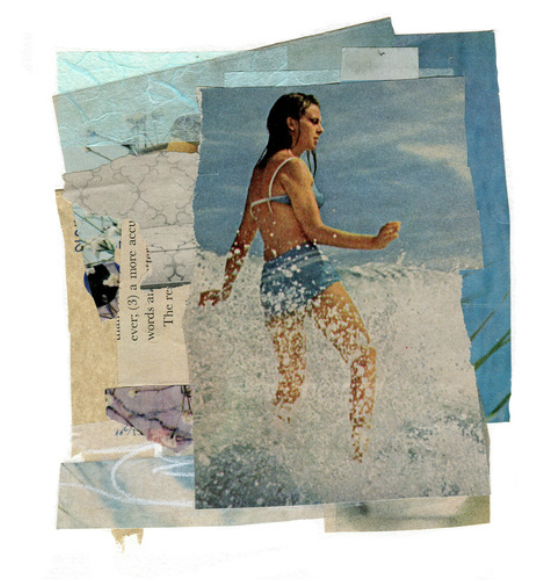
 I think this image of a 60s surfer girl totally rocks. It's a terrific photo with all the splashy ocean spray, her bathing suit is pretty cute, and the colors are lovely. What I like the best about this photo is her pose. She looks like a still image from a Bob Fosse show, yet on a surfboard. Totally amazing!
Although I've lived only a mile away from the ocean for most of my life I'm a terrible swimmer. Boogie boarding in the little kids area is as close as I get to real surfing (but it's great fun and I can totally pretend that I am really surfing, just like the little kids). Still, I really identified with the image of this surfer girl. I mean, who wouldn't want to be her? I decided to place her on top of a cascading pile of layered vintage papers. Now she's in my element, collage. What's your element?
2 Comments
 My Chine Colle explorations have been going well in terms of fun and creativity but not so well technically. I've been using a (new to me) printmaking paper, Rives BFK. And my work has been wrinkling like crazy when using a water base (Methyl Cellulose) adhesive.
Rives Advantages: This paper has a beautiful creamy color and texture. It also rips easily to create lovely edges. If you like to use white space as a design element, your collages will look at least 20% better on BFK as opposed to a standard mixed media paper like Strathmore. It's basically like putting a Spanx on your work (collage or drawing). Rives Disadvantages: Because this is a printmaking paper it will stretch when it gets damp, whether or not you are using a press. The area where you adhere your collage papers will not stretch at all. This can result in some major buckling. Once the wrinkles set it they are pretty much permanent.) I did have some luck re-dampening and ironing my collages on the reverse side.) Takeaway: When using a printmaking paper like Rives BFK use the "driest" adhesive you can: a light swipe of a glue stick or spray glue. Let the collage air dry quickly rather than put it under a stack of books. I've tried pre-stretching a few sheets this week by dampening them, running them through the press and taping them to a board to dry. Will post an update. What is your favorite paper or substrate for collage?  "Chine Colle" basically translates to "thin paper collage" in French. It is done with a printmaking press, and most often used to print on paper that is too thin and delicate to go through the press on its own, and to add texture and color to etchings. I decided to try this technique to create transparent/translucent layers using collage elements. I used powdered methyl cellulose, a traditional bookbinding adhesive as my glue. Because I loved the look of Chine Colle (but am not a printmaker) I "cheated" by drawing on tracing paper and using these pieces as collage elements. What worked? I love the way the collage papers seems to really bond with the background paper. (I used Rives BFK.) Loved the Rives paper, it's not just for printmaking. Also, combining drawing with collage is something I'm now very interested in exploring. What didn't work so well: When the paper came out of the press is was completely flat, and very damp. I placed each collage on layers of clean newsprint, covered with a sheet of freezer paper (face down to prevent sticking) and put my collage sandwich under a heavy stack of books. At first it was completely dry, or so I thought. After a few days the paper started to curl ... alot! In the future I'm going to change the newsprint and leave the collage under the books for at least a week. 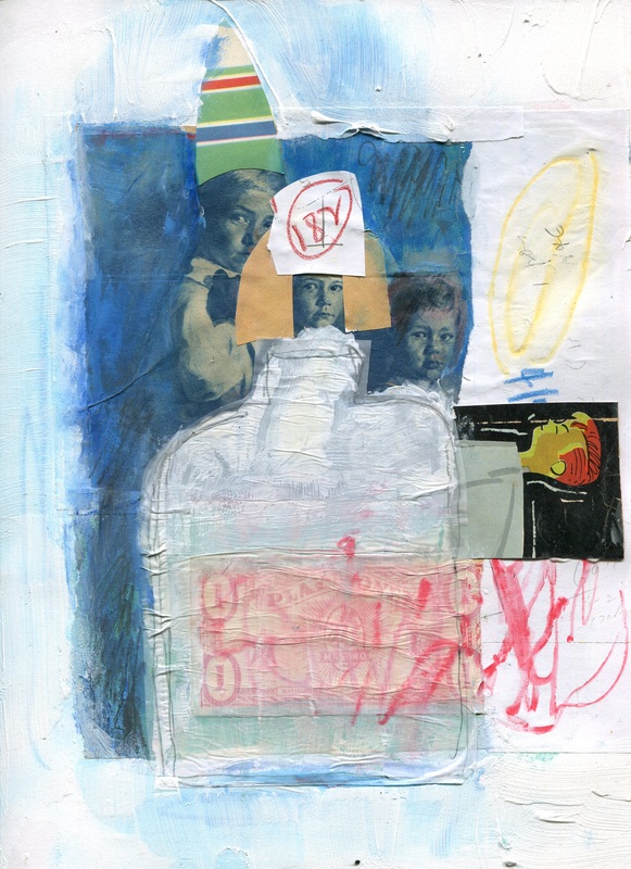 When is a piece of art successful? It could be successful if it sells, is shown in a gallery or gets a ton of hearts on Instagram. Art for me is more about how it feels than how it looks. It doesn't need to look right in terms of composition or other formal elements. If it helps me "move"move emotions that have been stuck inside for a long time then it really is an important piece, regardless of whether it looks good or even connects with other people.
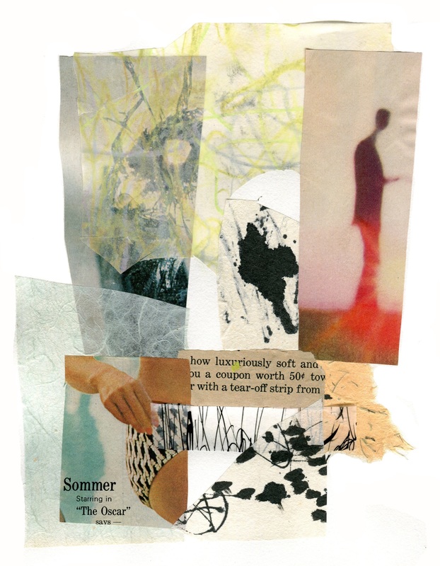
I've started seeing a new therapist so I've had to talk about my childhood a lot. Ugh, this was really difficult because even after so many years many of the memories are still very raw. I did this piece about the intersection of the world of childhood and the incomprehensible grown up world where really terrible things can happen. (My dad was very ill and died when I was six.) I feel like I've finally made a bit of progress by connecting with the feelings and translating them into images I put on paper, owning them and honoring them. When you work in your art journal what makes a "successful" page? 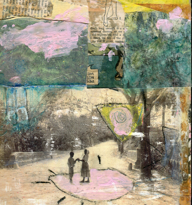 When I was a child I overheard relatives talking about wild times in Cuba the 50s and it sounded really glamorous and exotic. I've always answered the question "Where would you most like to visit?" with "Cuba!"
Even though travel restrictions have lifted a bit my budgetary restrictions have not, so my son gave the the beautiful book "I Was Cuba" for Christmas this year. The bottom image is a photo from the book, copied on a color laser printer and transferred onto wood. The rest is the Cuba of my imagination. I've had lots of time to create my imaginary "Cuba" and really hope to visit the real Cuba someday soon. 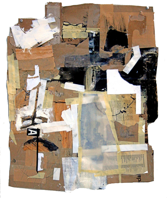 I have a large supply of brown paper bags because plastic shopping bags are illegal in my town and I'm always forgetting to bring the reusable ones. I find that painting on the brown bags and other "trash" is a great way to loosen up and get into the process not the finished product. For this piece I started taping bags together to make a 2 x 3 ft surface, then used 5 different kinds of tape, collage and paint.
One of the most fun things about this collage was the lively comment thread on FB after I asked for title suggestions. Titles included "50 shades of Mouse" (several people saw mice, I don't see them, do you?), "Got My Brown Paper Bag and My Take Home Pay", "Sacked" and my favorite, "Scraps of Life". 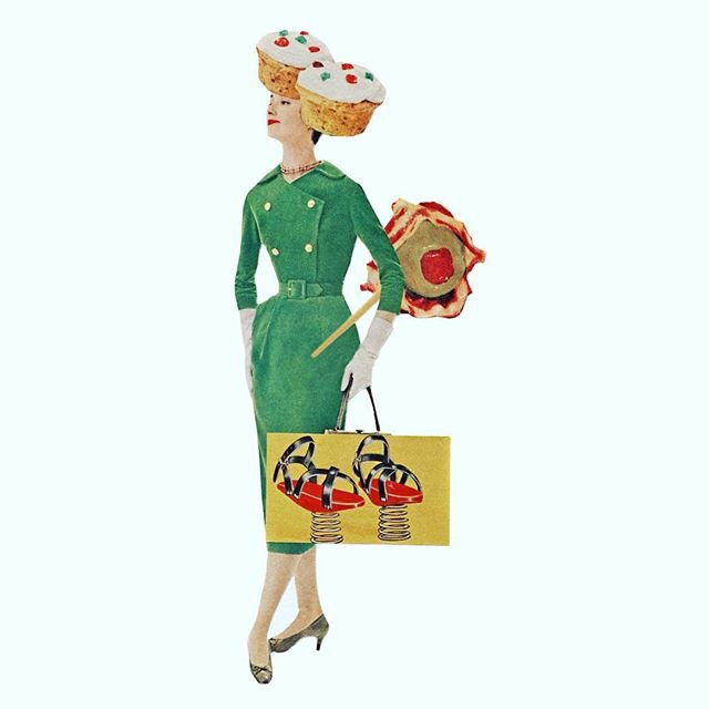 Times have certainly changed, but I'm sure I'm not the only one would could use springy shoes to get it all done before Xmas (and work off all those holiday calories)!
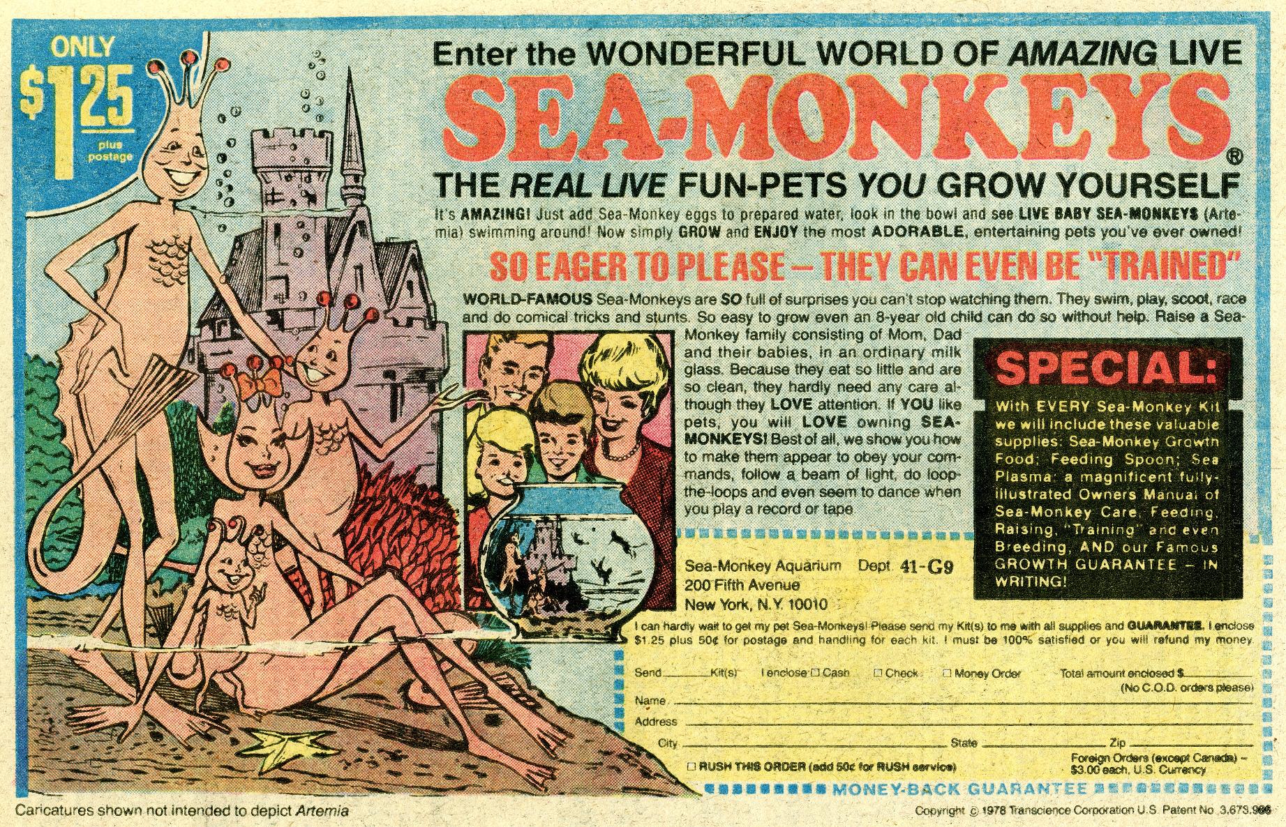
I'm fascinated by mid 60s style and culture. It was an age of innocence desperately tottering on the edge of extinction. With great colors & design! Soon there would be more freedom, more conflict, more drugs, and ... a whole new color palette. 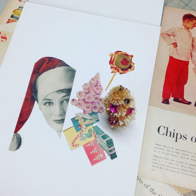 This year I dove into my collection of mid 60s Women's Day magazines to create my annual holiday card. I quickly found myself floundering in a sea of tacky nostalgia: colored toilet paper, Sea Monkeys and other mail order fantasies, virtually inedible jello molds, and impossibly difficult (and often hideous) holiday crafts. Christmas with my mom pretty much centered around the pages of these magazines. We found so much joy making the budget friendly treats and holiday ornaments featured in Woman's Day and Family Circle. We made a clever center pieces from evergreens in the yard and sent away for gifts in the special advertising section that practically never panned out, like a tiny working spy camera and a lemon tree that (never did) grow real lemons. I finally did make my collage Christmas card, but it took me a really, really long time because I enjoyed reading the magazines so much! 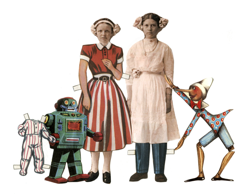 Don't you just love this pair of creepy girls is from the Lunagirl Edwardian Gothic digital collage sheet? I happened to find some paper dolls that were just their size and thought they could do with a a makeover. They've been wearing those some old white dresses for over a century! And once they got dressed it seemed fitting to give them a few friends to go trick or treating with. This collage really makes me laugh because in spite of they fun outfits and fun friends they still refuse to crack a smile.
I did a little research on why people rarely smiled in old photos. One reason is that they had to hold a long pose for the long camera exposures. Another seems to be about what was "in" at the time. People with big smiles in photos were considered to be lewd, poor, drunk or stupid. Throughout the history of portrait photography people have the same goal, they want to impress other people. So being serious in a photo back in the day was just as important as looking like you're having fun in a selfie is today. 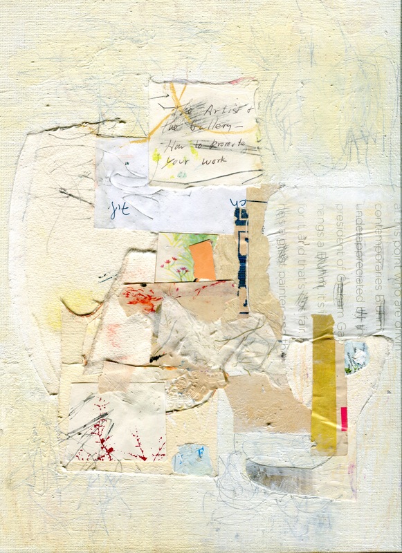 The text in the middle comes from an invitation to a meeting for a local artist's group, the topic was "how to promote your work". The postcard is from the 80s. I didn't go, but I stuffed it in a box where I save envelopes, stamps and postcards.
I still don't know how to promote my work, but its really fun to share online and to discover artists who inspire me. Today I discovered Emily Klein, a mixed media artist, art journal maker and teacher. I was searching "art journal" on Google and her page really spoke to me. She doesn't rely on cute birds, flowers or faces or even inspiring slogans -- her pages are really cool! I'm thinking "maybe I could do an art journal". Thanks for the inspiration Emily! |
Create
|
 RSS Feed