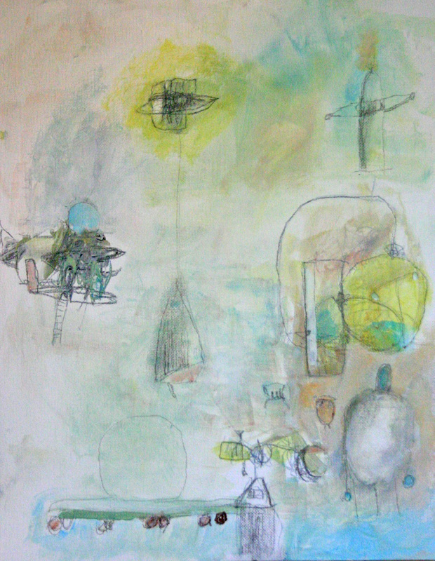
 This is the second piece I created in Eva Deutsch Costabel's workshop, The Healing Power of Painting at The Creative Center in New York. The pieces in the blog post below were the first ones I painted. I had to get the frustration out in the first works by using lots of bright colors, thick paint and black line to get to this more meditative state. I call this piece "Sweet Dreams and Flying Machines". I created it on canvas board using pencil with acrylic paint wash. When I sit down to create I never know what is going to come out, it's a wonderful adventure! I've never done any work like this before and I felt like I was exploring a whole new world without ever leaving my studio.
0 Comments
 My Chine Colle explorations have been going well in terms of fun and creativity but not so well technically. I've been using a (new to me) printmaking paper, Rives BFK. And my work has been wrinkling like crazy when using a water base (Methyl Cellulose) adhesive.
Rives Advantages: This paper has a beautiful creamy color and texture. It also rips easily to create lovely edges. If you like to use white space as a design element, your collages will look at least 20% better on BFK as opposed to a standard mixed media paper like Strathmore. It's basically like putting a Spanx on your work (collage or drawing). Rives Disadvantages: Because this is a printmaking paper it will stretch when it gets damp, whether or not you are using a press. The area where you adhere your collage papers will not stretch at all. This can result in some major buckling. Once the wrinkles set it they are pretty much permanent.) I did have some luck re-dampening and ironing my collages on the reverse side.) Takeaway: When using a printmaking paper like Rives BFK use the "driest" adhesive you can: a light swipe of a glue stick or spray glue. Let the collage air dry quickly rather than put it under a stack of books. I've tried pre-stretching a few sheets this week by dampening them, running them through the press and taping them to a board to dry. Will post an update. What is your favorite paper or substrate for collage?  "Chine Colle" basically translates to "thin paper collage" in French. It is done with a printmaking press, and most often used to print on paper that is too thin and delicate to go through the press on its own, and to add texture and color to etchings. I decided to try this technique to create transparent/translucent layers using collage elements. I used powdered methyl cellulose, a traditional bookbinding adhesive as my glue. Because I loved the look of Chine Colle (but am not a printmaker) I "cheated" by drawing on tracing paper and using these pieces as collage elements. What worked? I love the way the collage papers seems to really bond with the background paper. (I used Rives BFK.) Loved the Rives paper, it's not just for printmaking. Also, combining drawing with collage is something I'm now very interested in exploring. What didn't work so well: When the paper came out of the press is was completely flat, and very damp. I placed each collage on layers of clean newsprint, covered with a sheet of freezer paper (face down to prevent sticking) and put my collage sandwich under a heavy stack of books. At first it was completely dry, or so I thought. After a few days the paper started to curl ... alot! In the future I'm going to change the newsprint and leave the collage under the books for at least a week.  When is a piece of art successful? It could be successful if it sells, is shown in a gallery or gets a ton of hearts on Instagram. Art for me is more about how it feels than how it looks. It doesn't need to look right in terms of composition or other formal elements. If it helps me "move"move emotions that have been stuck inside for a long time then it really is an important piece, regardless of whether it looks good or even connects with other people.
I've started seeing a new therapist so I've had to talk about my childhood a lot. Ugh, this was really difficult because even after so many years many of the memories are still very raw. I did this piece about the intersection of the world of childhood and the incomprehensible grown up world where really terrible things can happen. (My dad was very ill and died when I was six.) I feel like I've finally made a bit of progress by connecting with the feelings and translating them into images I put on paper, owning them and honoring them. When you work in your art journal what makes a "successful" page? 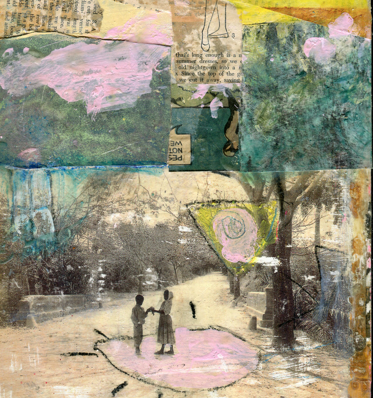 When I was a child I overheard relatives talking about wild times in Cuba the 50s and it sounded really glamorous and exotic. I've always answered the question "Where would you most like to visit?" with "Cuba!"
Even though travel restrictions have lifted a bit my budgetary restrictions have not, so my son gave the the beautiful book "I Was Cuba" for Christmas this year. The bottom image is a photo from the book, copied on a color laser printer and transferred onto wood. The rest is the Cuba of my imagination. I've had lots of time to create my imaginary "Cuba" and really hope to visit the real Cuba someday soon. 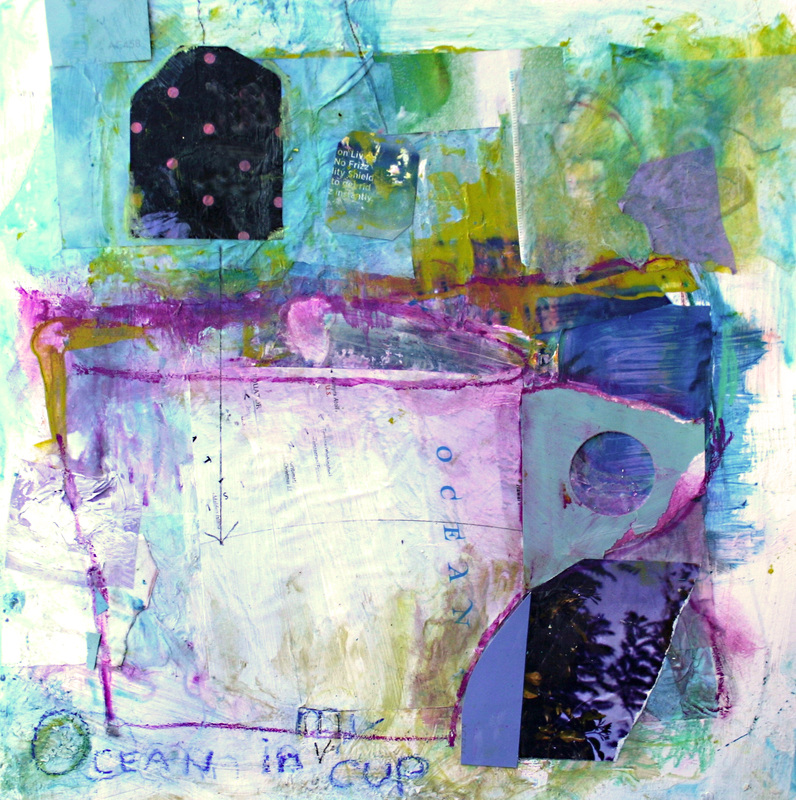 I usually steer clear of recognizable & cute images but today I just gave in to it. All of a sudden I had a cup with the word ocean written on it, and in a way there is ocean in my metaphorical cup. My life is filled with solitary beach walks this time of year along with solitary studio time (ocean and paint). As much as I love the beach I'd like to see some people and cold cash showing up in my cup as well. Hmmmmm ... maybe I should paint them in?
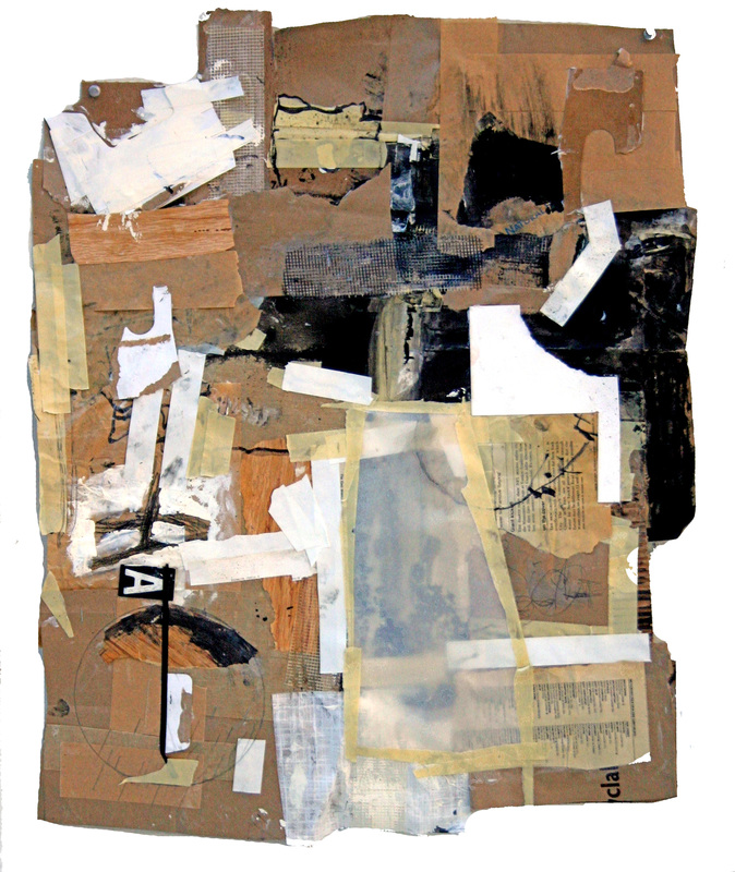 I have a large supply of brown paper bags because plastic shopping bags are illegal in my town and I'm always forgetting to bring the reusable ones. I find that painting on the brown bags and other "trash" is a great way to loosen up and get into the process not the finished product. For this piece I started taping bags together to make a 2 x 3 ft surface, then used 5 different kinds of tape, collage and paint.
One of the most fun things about this collage was the lively comment thread on FB after I asked for title suggestions. Titles included "50 shades of Mouse" (several people saw mice, I don't see them, do you?), "Got My Brown Paper Bag and My Take Home Pay", "Sacked" and my favorite, "Scraps of Life". 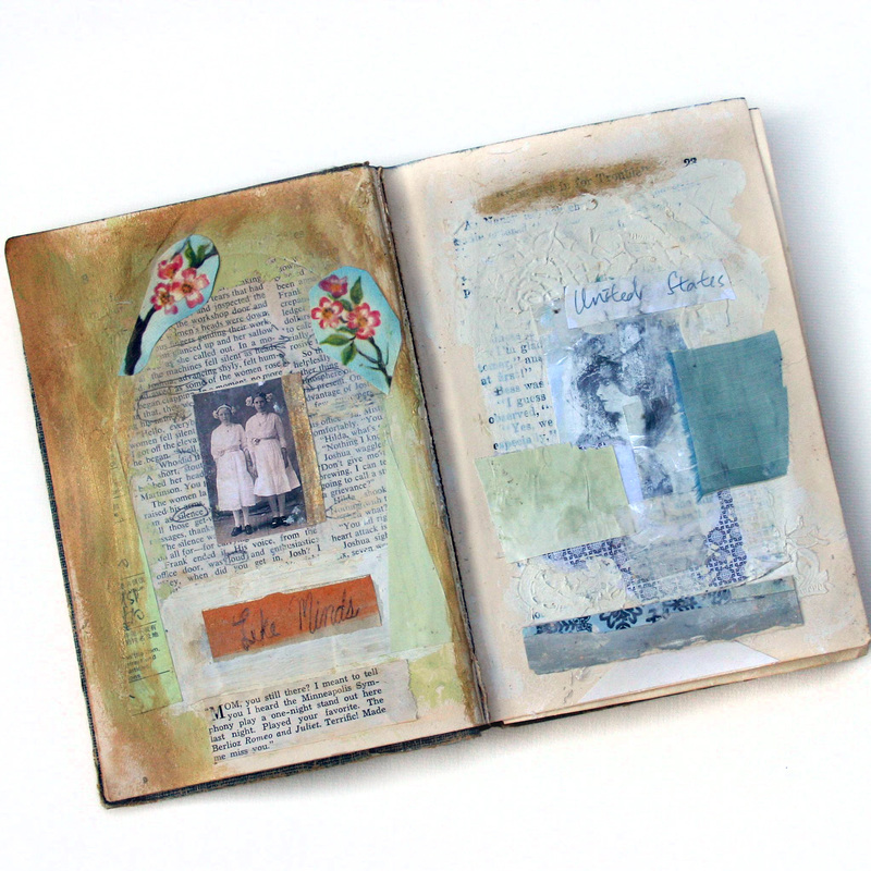 Do you have an old photo album around the house and wish you knew something more about the people in it? What are their names? How are they related? What were they like?
I have a very old photo album I found in that attic. I don't know if the people in it are relatives or if someone in my family thought it was super cool and picked it up as a garage sale. I find it really interesting to look it over on a rainy day and imagine what they might have been like. I chose several photos from the Lunagirl Edwardian Gothic digital collage sheet and decided to experiment with the idea of giving them a story. A vintage Nancy Drew book was used as the base and Golden Matte Medium strengthened the vintage book pages. It worked really to preserve the delicate look of the pages and provide a substantial surface for the paint and collage elements. I'm on the Lunagirl design team and the challenge for October is "Gothic". Its really been a lot of fun! The challenge is open to create in any media and is open through the end of the month. 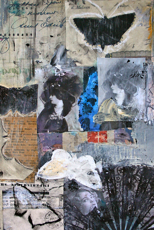 This mixed media collage is inspired by Lunagirl Edwardian Gothic digital collage sheet and the fact that my roommate thinks that moths are the souls of dead people. Yes, moths are surrounded with a ton of international folk lore associating them with death. An Edgar Allen Poe story, The Sphinx, was inspired by moth lore.
Maybe my friend doesn't really believe it, but she does say it. She says it when the moths are looming around my brown rice and when they are hovering around my treasured vintage cashmere sweaters. At that point, if she isn't in the room, I admittedly will do away with them in one way or another. They can go the easy way (cooperate and go outside) or the hard way. Either way, it was much easier to accomplish before she started hounding me about how they are souls of the dead. If you are interested in finding out more about moth lore (tis the season, right?) I highly recommend this beautifully written post by Stu Hovath on Unwinnable. 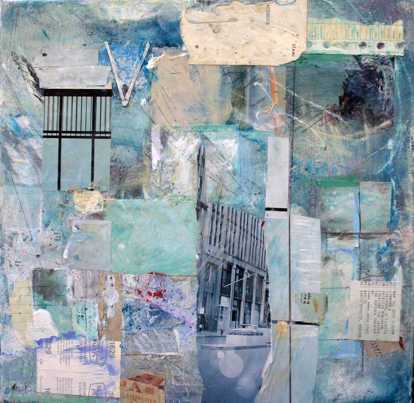 This piece is titled "Rain." The sounds of a rainstorm on the roof of my attic studio triggered up all kinds of memories of other rainy days and moods. Luckily the storm, "my playlist/soundtrack" lasted long enough for me to finish it.
I was Randel Plowman's Collage a Day project & decided to do the same for one month. It took me a few years and several of Randel's excellent online workshops (where I met a supportive network of kindred spirits) to work up to it. Phewwwww, I managed to do it, and managed to go with the flow when the collages started to morph into mixed media paintings. Takeaways: * It was easier than I thought, but not easy. * It was a little scary because I was entering into unknown territory and did my best creating in a kind of meditative state. I feel like I've become a better artist but on the downside a slightly weirder person. I was already weird enough already! * I'm going to continue because it feels like some kind of journey/quest at this point. I'm plan on experimenting with working larger (something I've never done). I would definitely recommend committing to this kind of challenge in a chosen medium or more broadly to do anything creative as a daily practice. I also found Noah Scanlin's book 365 Make Something Every Day and Change your Life very inspirational. The subtitle is "Make Something Every Day and Change Your Life". Inside the book Noah talks about his experience and says "results may vary" but that "small, incremental steps I took every day added up to something much bigger than the individual parts". |
Create
|
 RSS Feed